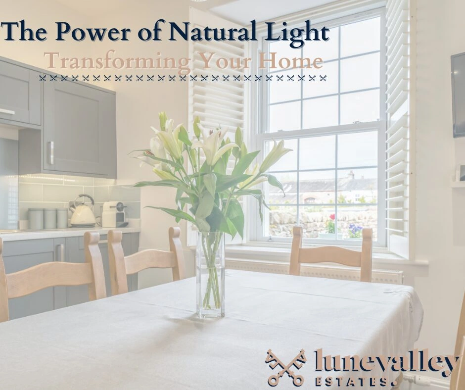
Sun-Kissed Spaces: Transforming your home with the power of natural light!
As the saying goes, “Let there be light!” Natural light has a transformative effect on the atmosphere and functionality of…


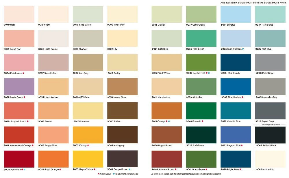
Choosing the perfect colour and decor for your home can be quite a task. But don’t worry, it’s totally normal to feel that way! Your home’s colour scheme is essential because it affects both your emotions and the overall ambiance of the room. Instead of simply going with plain white or grey, why not take some time to consider different colours and their effects? It’s a fun and meaningful way to create a space that truly reflects your personality and style. So, let’s get creative and explore the wonderful world of colours!
First we need to get to grips with the basics:
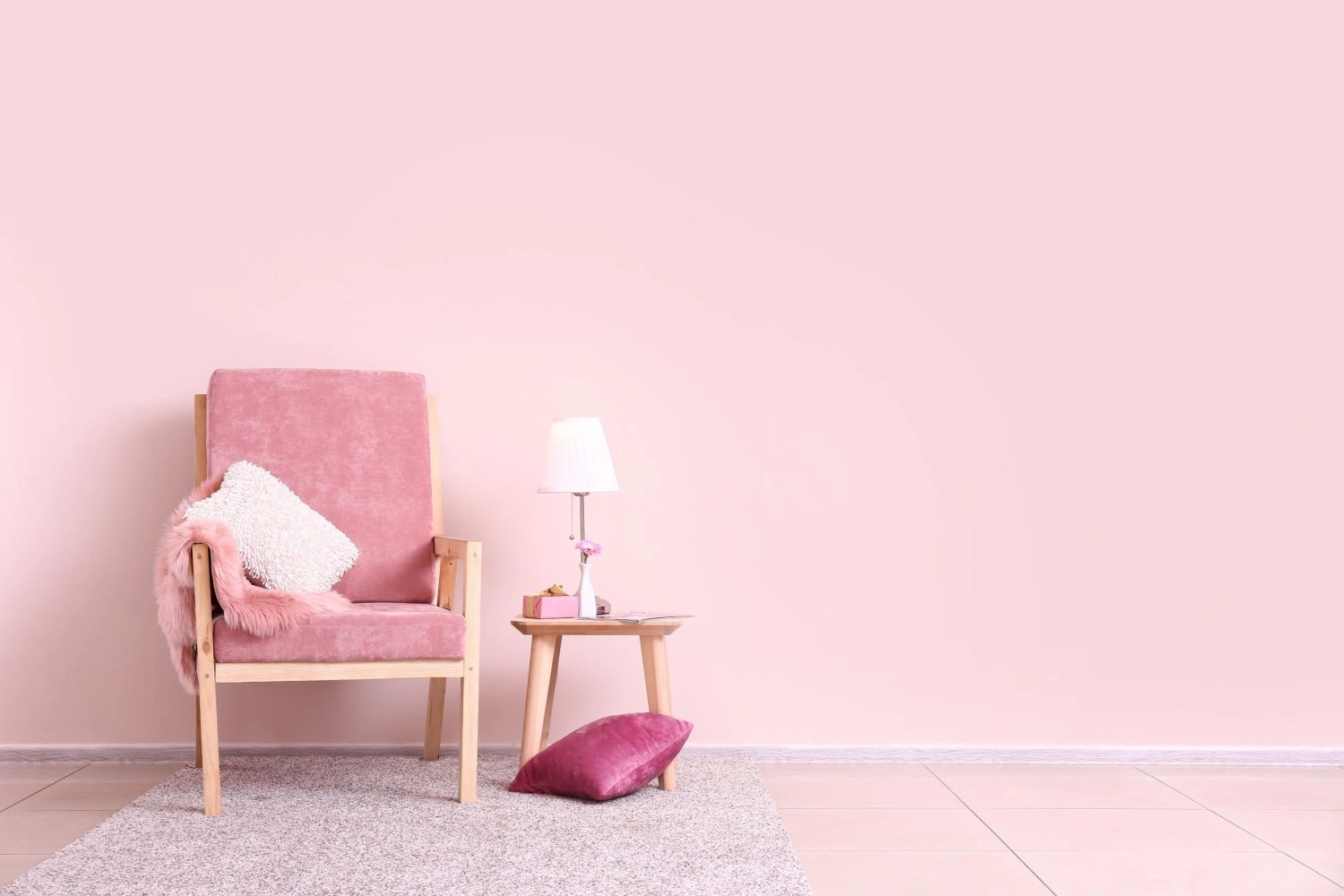
Pales – These lovely light shades will instantly uplift your mood with their airy and refreshing qualities.
Neutrals – Embrace the beauty of earthy and subtle tones that help you feel grounded and connected to nature.
Whites – Timeless and pure, these classic colours provide the perfect blank canvas for you to showcase your unique style.
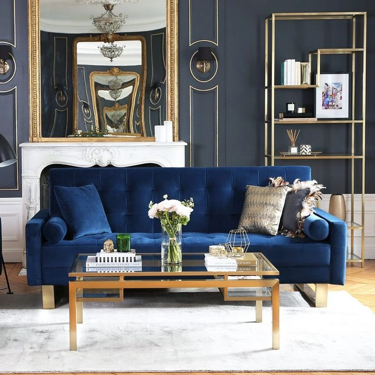
Deeps – If you’re into drama and mystery, go for these rich and captivating colours to add a touch of allure to any room.
Warm Versus Cool
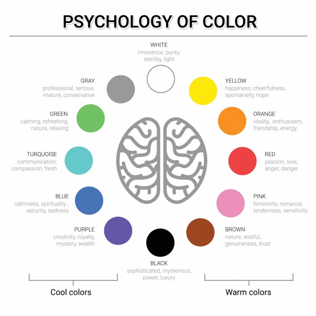
Let’s break it down! When it comes to paint colours, there are two basic types that influence your mood: warm and cool. Warm tones are those radiant colours that bring happiness and energy to a room, making you feel vibrant and alive when you step in.
On the other hand, cool tones are tranquil and soothing, creating a sense of calmness and relaxation. So, choosing whether you want your room to energise you or help you unwind can already narrow down your options significantly!
Within the warm and cool categories, each paint colour has its unique impact on your mood. Understanding how these colours make you feel is a fantastic way to determine the perfect colour direction for your room. So, let’s find that perfect colour that suits your mood and style!
Colours Throughout the Home
Welcome to your peaceful sanctuary, your bedroom! It’s a space where relaxation and tranquility should reign supreme. So, let’s talk about bedroom colours and how they can influence your mood positively. When choosing the perfect room colour for your bedroom, consider the psychological effects of certain shades like green, blue, and purple, which are known for their calming and restful qualities.
Here are some colours that work wonders in your bedroom:
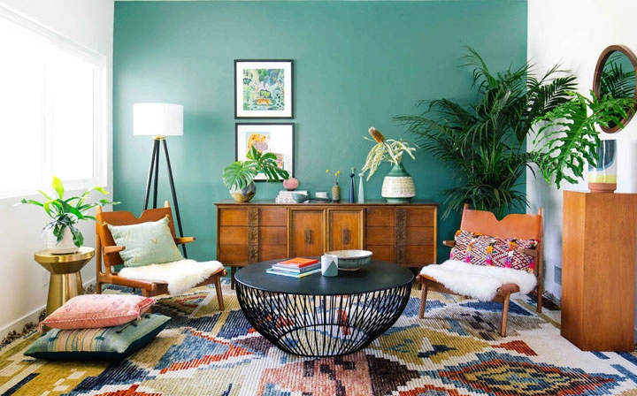
Let’s make your living room a hub of comfort, conversation, and camaraderie by exploring the wonderful world of colours! When it comes to living room colours, we want to create an inviting and happy space where you can unwind and connect with loved ones.
Consider these fantastic colours for your living room:
So, whether you want a soothing living room to relax in or an invigorating space for lively moments, the colour choices are endless.
The room colour psychology for your bathroom revolves around calming hues that promote relaxation and serenity. Here are some excellent colours for your bathroom walls:
Colours to embrace in your bathroom:
Colours to avoid in your bathroom:
Welcome to the heart of your home, the kitchen! This communal space is where creativity flourishes, and the whole family gathers to share wonderful moments. To enhance the joy and inspiration in your kitchen, let’s explore paint colours that promote creativity and happiness. Here are some fantastic options to consider:
Colours to embrace in your kitchen:
Room colour psychology plays a vital role in creating the right ambiance for this special space. Here are some excellent choices for your dining room:
Colours to embrace in your dining room:
Colours to avoid in your dining room:
Hold on, We aren’t Forgetting About black and White
Technically, they aren’t considered colours because white is a combination of all colours, while black lacks any colour.
But in the world of decorating, it’s quite rare to use true white or true black. Most paints have undertones that fit either the warm or cool colour groups, making them more versatile and suitable for various colour schemes.
That’s the beauty of it – you can always find a white or black shade that perfectly complements your chosen colour palette.
So, whether you’re going for a warm or cool colour scheme, rest assured that these neutral shades will be your best friends in creating a stylish and cohesive look for your space!
Now its over to you!
Remember, there are no strict rules when it comes to choosing colours for your space and the mood you want to set. It’s all about your personal preference and what inspires you. So many factors can influence your colour choices, like your current mood, life stage, cultural background, and even nostalgic memories from your upbringing.
Moreover, your home’s unique characteristics can also play a role in your colour decisions. Some spaces may call for a subtle and muted palette, while others beg for bold, playful, and adventurous colours. Whatever path you take, don’t be afraid to embrace your choices and have fun with them!
Ultimately, the colours you pick will add a personal touch to your home, making it a reflection of your style and personality. So let your creativity flow and enjoy the process of bringing your space to life with the perfect hues that resonate with you!
Happy decorating!